Charts help visualize data from tables.
After creating a table, the charts tool can be used to create a visualization of that table that tells the data story in a visual, easy to interpret manner.
Overview
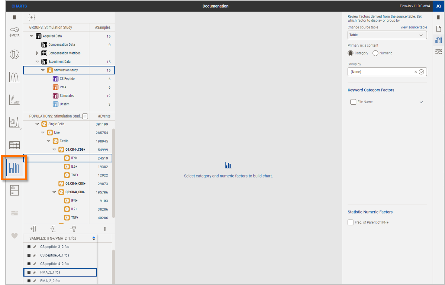
Chart creation is accessed from the from the chart tool in the Navigation Bar, highlighted in Figure 1.
The steps to create a chart are:
Select an existing table from within the FlowJo workbench to use as the source data from the Chart definition property in the properties panel. See the Table creation page for information on how to create a table.
Choose which categorical and numeric factors to include in the chart, also from the Chart definition property.
Use the Chart settings property to specify any formatting of the chart.

Figure 1 Creating a chart
Category and numeric factors
Once you have selected a table, you must select category and numeric factors to build a chart.
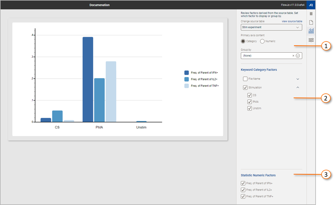
A categorical factor is typically metadata embedded in the experimental data as a keyword. In Figure 2, callout displays the keywords present in the table used to create this chart. In this example, ‘File Name’ and ‘Stimulation’ were the keywords present. Stimulation is checked for use, and the list expanded to show the values of the Stimulation keyword. All are checked for use in this example, but clicking any of the checkboxes immediately removes the value.
A numeric factor is a value that will be used as the height of a bar chart, or width of a pie chart slice to represent the magnitude of a measurement. In the example presented in Figure 2, callout displays three statistics garnered from the input table that are displayed in the chart. Unchecking any immediate removes that statistic from the chart.

Figure 2 Table Controls
Charts are dynamic, all changes immediately cause the chart to update, including gate adjustments, and adding or subtracting categories or numeric factors.
Additional tools for building and modify charts are discussed in:
Chart definition
Chart settings
Chart creation example
