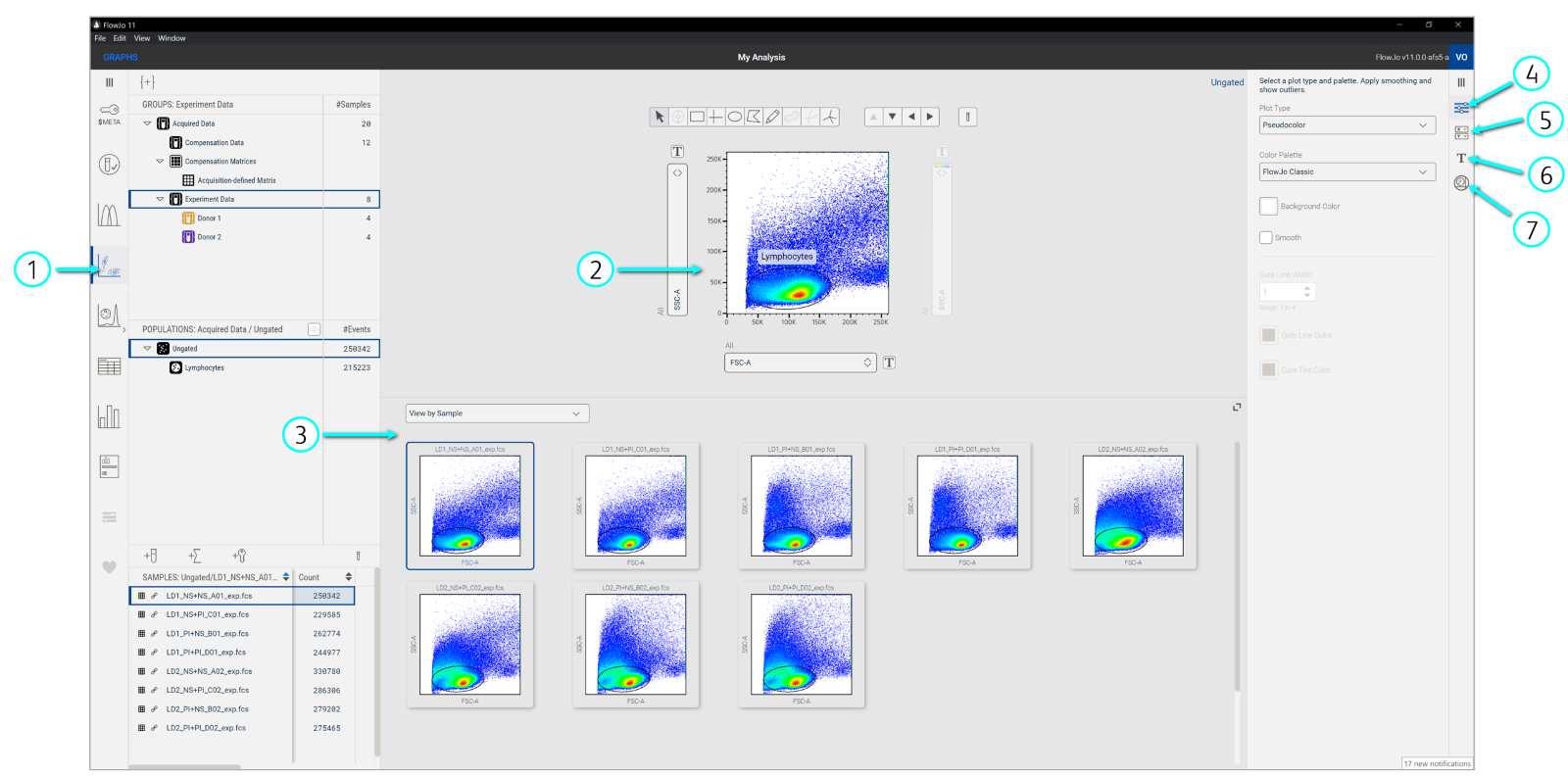
The Graphs context allows you to draw gates and see all your data at once in a single interface.
Gates subset events into populations based on marker expression. Drawing gates within gated events builds a population hierarchy or ancestry, where one can have child, parent, and grandparent gates. This is a key part of flow cytometry analysis because it allows us to focus our investigations on phenotypes of interest. The Graphs context (Figure 1) has various features to not only draw gates but also visualize your data in different ways to guide analysis.


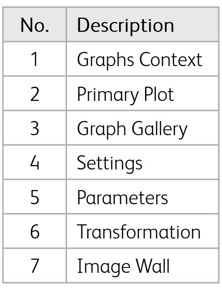
Figure 1. Graphs context
Displaying a graph: Select Graphs in the Navigation bar to launch plots in the Discovery panel. Next, click the sample in the Sample panel that you want to see in the Primary plot. By default, data will be displayed as a psuedocolor plot (default plot types can be changed in your Preferences). Select from several different types of plots and color palettes in the Settings of the Graph Properties panel.
Managing parameters: Select which parameters you’d like to see from the dropdown menus along the axes of the Primary plot. You can also select which parameters to visualize from the Graph Properties panel. In this expanded view, you can see and use parameter sets to quickly filter for desired parameters (e.g. scatter, compensated). Create and manage custom parameter sets in the Metadata Manager.
Adjusting scaling and transformation: Visually expand or compress data points on the plot by clicking the Transforms [T] button beside each axis or clicking Transforms in the Graph Properties navigation bar. Either option will open the Properties Panel to show controls for adjusting the scale and range of parameters.
Gating populations: Select a group of samples from the Group panel. Click on one of the gating tools above the Primary plot then click inside the plot to form the gate with a click-and-drag of your mouse. Once the gate is set, a prompt to name the population will appear and it will be added to the group’s hierarchy in the Populations panel. The gate will also be automatically applied to all samples in the selected group. Double-click a gate in the plot or click a population node in the Population panel to focus on or subset that population in a new Primary plot. You can drag and drop single gates or entire gating hierarchies to other gates or groups.
Visualizing data in the Graph gallery: This part of the Graphs Discovery panel has various visualizations to see multiple samples or parameters all at once. Use the dropdown menu at the top of Graph gallery to change the display. View by Sample shows the current view in the Primary plot for all samples in the selected group. View by Ancestry shows the full gating hierarchy for the selected sample. View by Parameter shows every parameter in your selected sample, each plotted on a separate graph, with parameters alternating on either the x- or y-axis of each plot.
Imaging data: Imaging controls are available for data generated from the BD FACSDiscover S8. With proper folder structure, the workbench will retrieve .tiff files associated with .fcs files from the same acquisition experiment and display them in the Image wall. Use the imaging controls to adjust channel settings and set color palettes for images. Click the icon on the corner of the image display panel to turn on Imaging linking, which marks the location of any imaged event on the Primary plot.
