The Primary Plot provides an interface to gate cells of interest and build a population hierarchy.
In flow cytometry analysis, we identify cell types based on their expression pattern for a given set of markers. Typically, this is done through a process called ‘gating’, whereby we subset cells into ‘populations’ and continue sub-setting them to reach populations of interest, essentially building a hierarchy. In the Primary Plot, you can visualize your data and gate populations with a variety of gating tools (Figure 1).
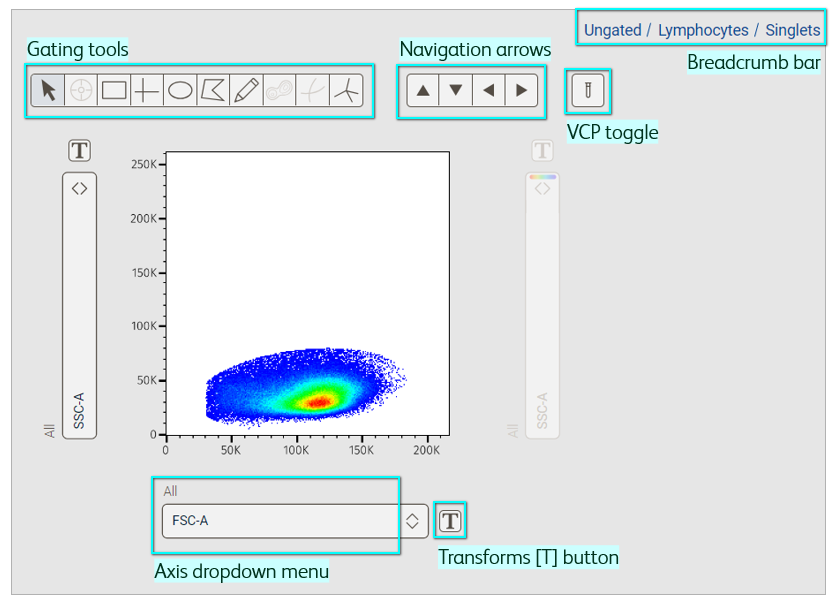
Figure 1. Primary plot
Display a sample
Select Graphs in the Context navigation bar to launch plots in the Discovery panel (Figure 2). Next, click the sample in the Sample panel that you want to see in the Primary plot. Quickly change the sample being displayed by selecting another one from the Sample panel or Graph gallery. You can also use the left and right navigation arrows in the Primary plot.
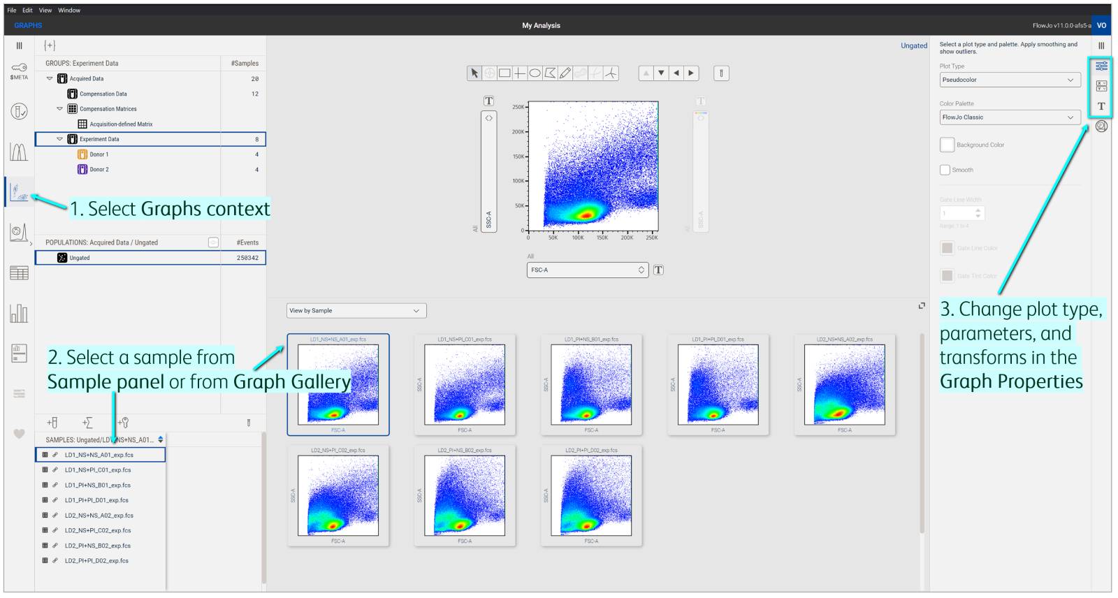
Figure 2. Displaying data in the Primary plot
The Graph properties panel contains controls for customizing the Primary plot. By default, data will be displayed as a pseudocolor plot (default plot types can be changed in your Preferences). Select a different type of plot (e.g. contour, dot, or histogram) and color palette in the Settings property. Similarly, the parameters displayed on the axes by default are forward scatter-area (FSC-A) and side scatter-area (SSC-A), but can be changed using the axis dropdown menu or Parameters property. Visually expand or compress data points for one or more parameters by clicking the Transform [T] button beside either axis or going to the Transforms property.
Select a gating tool
Various gating tools are available in the Primary plot (Figure 3) and are described below.

Figure 3. Gating tools for biaxial plots
Arrow: Used to select gate objects.
Event Inspector: Used to display representative images of selected events within the Primary plot.
Rectangle: Draws a rectangle with four right angles. You can adjust the size and shape.
Quadrant: Draws four rectangular gates sharing a common center point. The center point and size of each quadrant can be adjusted, but not the angle.
Ellipse: Draws a round gate. You can adjust the size and shape.
Polygon: Draws freeform shapes where edges are established with a click-and-drag of the mouse. Edges of the gate are straight lines connected by vertices.
Pencil: Like a polygon gate, but edges of the gate can be curved. FlowJo creates a vertex at fixed intervals when using the freehand tool.
Autogate: Draws a polygon matching the distribution of events in the two specified dimensions using the same algorithm for identifying contour lines for contour plots.
Curly quadrant: Like quadrant gates, but with exponential curves in each dimension to better model increases in the data.
Spider quadrant: Draws bordering polygons that share common vertices, dividing the plot into quadrants. The center point, size, and angle of each section can be adjusted.
Line drawing tools suitable for histogram plots are also available (Figure 4).
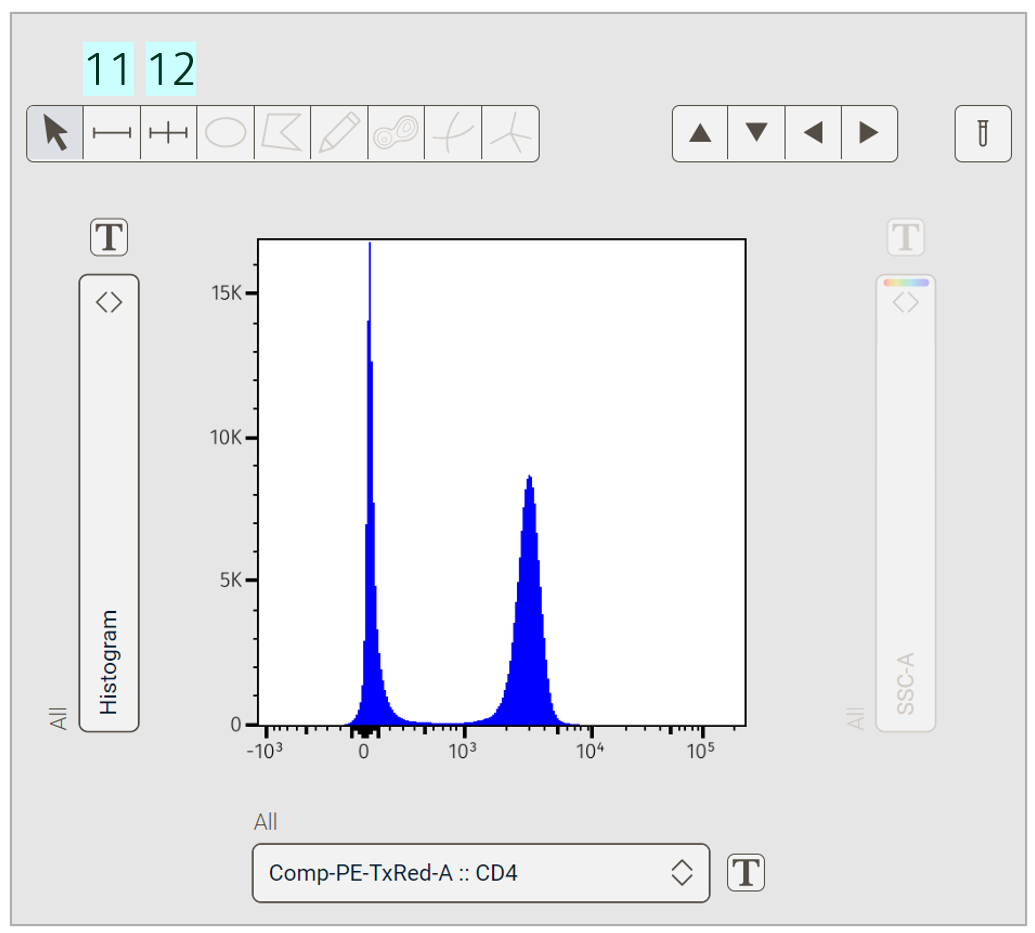
Figure 4. Gating tools for histogram plots
Ranged: Draws a single gate of any size.
Bisector: Draws two gates that split the graphical display in two. This is particularly useful with bimodal data (discrete positive and negative populations).
Which gating tool should I use? Rectangle and ellipse gates are the most efficient to draw and are common primary tools for analysis. The flexibility of polygon and pencil gates makes them ideal for capturing populations with complex distributions on the plot. Autogates help speed up complex gate drawing. Quadrant gates are a great way to subset multiple populations at once, a common approach for identifying memory subsets or combinations of cytokine-producing cells. Line drawing tools help capture populations in a histogram view, but univariate representations can sometimes mask autofluorescence from a fluorescent parameter not seen in the plot, so use histograms with caution for gating1.
Draw a gate
After selecting a sample and gating a tool, click inside the plot and draw the gate with a click-and-drag of the mouse. Once the gate is set, a prompt to name the population will appear and it will be added to the group’s hierarchy in the Population panel (Figure 5). For quadrant gates, each quadrant population will be automatically named using the parameters displayed on the axes, but populations can be renamed (see next section). The gate will be automatically applied to all samples in the selected group. In the example below, I started my analysis with a simple ellipse gate to clear debris and I called it Lymphocytes.
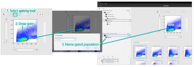
Figure 5. Drawing a gate in the Primary plot
Preview the location of your gate on all your samples in the Graph gallery or turn on Virtually Concatenated Populations (VCP) to temporarily merge your samples in the Primary plot.
Adjust, edit, or delete a gate
Although we define an initial gate on a single sample, we often need to adjust its size, shape and location during the course of our analysis to account for biological or technical variability between samples. To adjust the height or width of a gate, click on the gate and move the mouse to a vertex (white square on the gate lines). Click on the vertex and drag it to reshape (Figure 6). Adjust the position or center point of a gate by placing the mouse within the selected gate, then using a click-and-drag motion to move it to a new position.
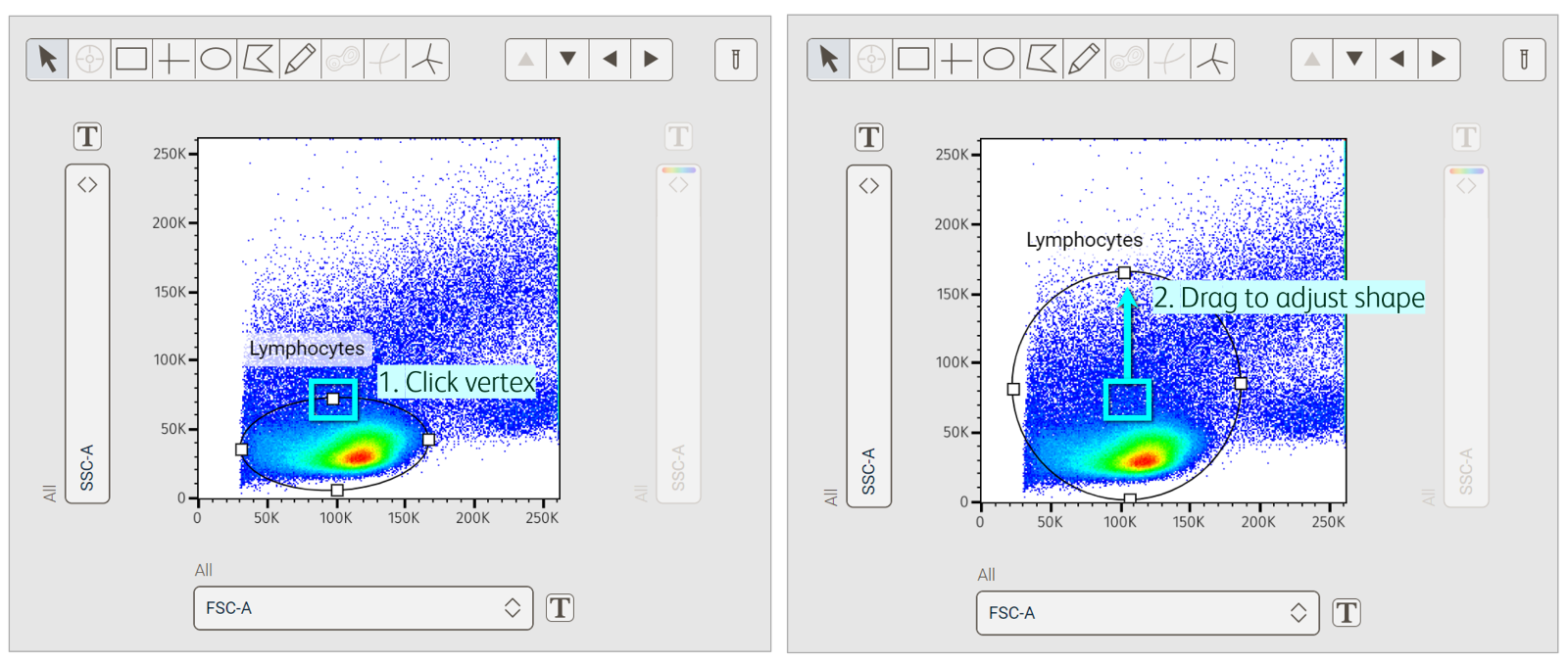
Figure 6. Adjusting the shape of a gate in the Primary plot
Rename a gate by right-clicking the gated population in the Population panel and selecting the option to rename (Figure 7). Delete a gate by right-clicking the gate in the Primary plot or gated population in the Population panel and selecting the option to delete.
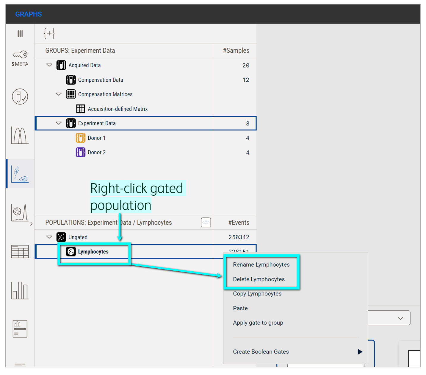
Figure 7. Renaming or deleting a gate from the Populations panel
From a hierarchy
To focus on or subset a population, double-click a gate in the plot or click the downward arrow in the navigation arrows. This will launch a new plot, with only the previously-gated population in view. As described above, create a new gate by selecting a gating tool and dragging your mouse in the plot to draw the shape.
Let’s return to the example I used previously (Figure 8). Here, I cleared debris by starting with a gate for lymphocytes but wanted to subset that population further to capture singlets (i.e. single cells that are not stuck together). So, I launched a new plot off the Lymphocytes population. Notice how Lymphocytes is selected in the Populations panel and is the final population in the Breadcrumb. I then changed the x and y parameters to gate for singlets. In essence, I have created a child gate (Singlets) off the parent gate (Lymphocytes). Notice these population names in my Populations panel; the Singlets gate is offset from the Lymphocytes gate, indicative of their ancestry or hierarchy in the gating tree.
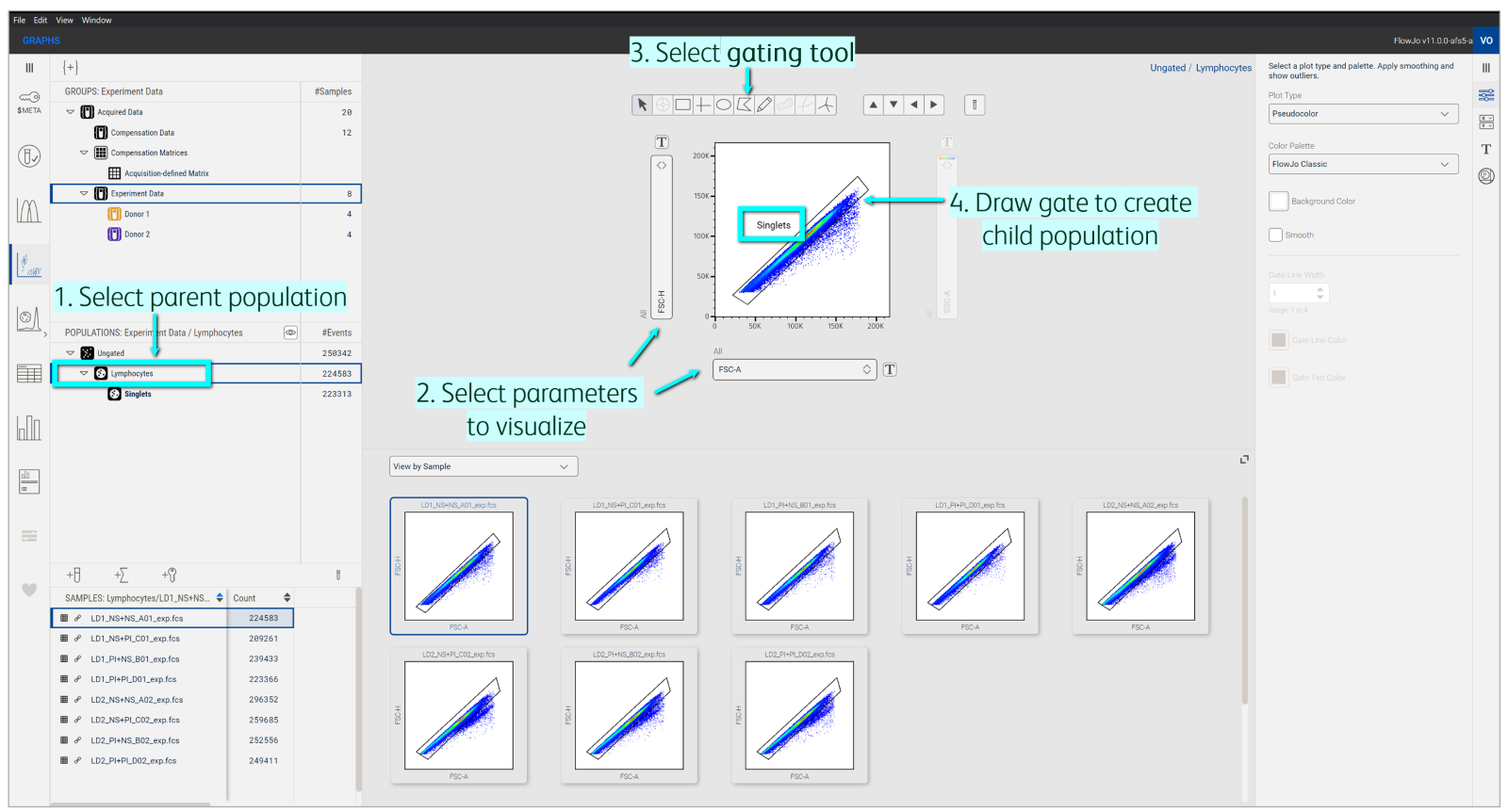
Figure 8. Gating a child population from a parent population to form a hierarchy
Copy single gates or entire hierarchies to other gates or groups in the Analysis tree. Navigate between populations in your hierarchy by clicking a population node in the Population panel or by using the up/down arrows and Breadcrumb bar in the Primary plot.
Unsure of where to place a gate? Backgating is a helpful tool that shows the final gated population within the population of its ancestors (i.e. if you took the final gate and applied it to each population above it in the hierarchy). This allows you to review if upstream gate placement captured downstream populations. For particularly dim markers or rare populations, consider using a fluorescence minus one (FMO) control, which is a sample that’s biologically similar to your test samples but stained with your full panel minus the dim/rare marker in question2. You can then use this FMO control to distinguish background from true positive signal for that marker.
References
Bushnell, T. Why You Need To Use FMO Controls For All Multicolor Flow Cytometry Experiments. Cheeky Scientist. https://expert.cheekyscientist.com/why-use-fmo-controls-multicolor-flow-cytometry-experiment/. Updated 2024. Accessed August 2024.
Bushnell, T. 4 Biggest Mistakes Scientists Make During Multicolor Flow Cytometry Cell Sorting Experiments. Cheeky Scientist. https://expert.cheekyscientist.com/biggest-mistakes-multicolor-flow-cytometry-cell-sorting-experiments/. Updated 2024. Accessed August 2024.
