FlowJo offers several options for visualizing your data in the Graph Window.
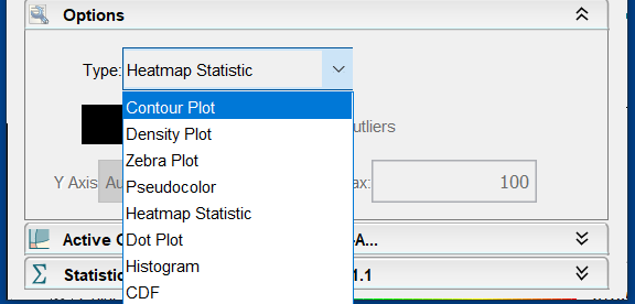
Once you have a graph window open, you can easily switch between graph types either by selecting the type (and/or options) from the graph menu, or by opening the options disclosure triangle at the bottom of the graph window.

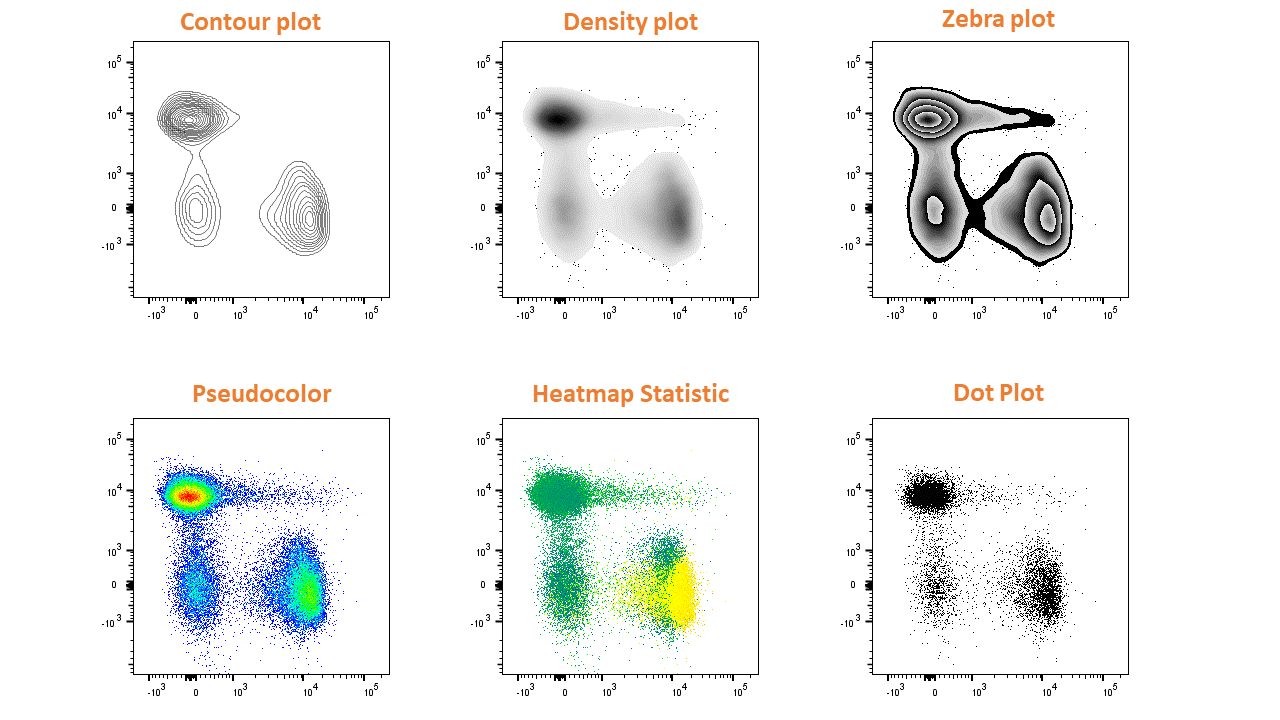
Which will allow you to visualize your two-dimensional data in the following ways:

When you close a graph window, FlowJo remembers exactly what you displayed (axes, options, and graph type). The next time you open that subset for display, FlowJo will show you the same graph setup. (The exception to this rule is if you open the parent graph window using the open parent (up-arrow) button in a graph window, this function opens the graph window as it looked when you created the gate for that subset).
There are two univariate and five bivariate display types. Each has several different options that can result in a wide variety of different graphics. Some are more suitable for publication in print, and some are more suitable for generating presentation slides.
The following types of graphs can be generated in the graph window:
Bivariate displays | Univariate displays |
|
Tags: FlowJo
