Use the T-button to quickly adjust data scaling and visualization.
Data visualization is key to identifying and gating different populations within a sample or experiment. Have you ever noticed how “cells” (events) pile up on the left or bottom axes? Perhaps you have antigen positive subsets that are only marginally brighter than controls? The “T” or “Transform” button provides you with a quick and easy way to visualize these events. Simply click the “T” button on the Graph Window and change the transformation settings to get your data on screen.

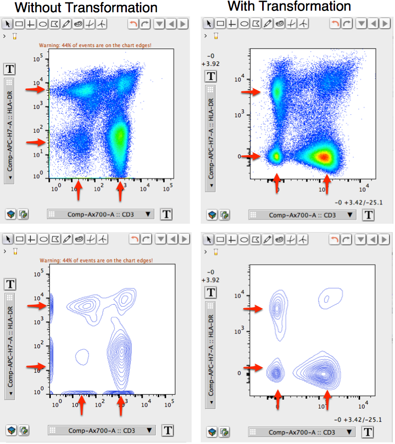
Fig. 1. Using the T button to resolve events on the axes. Densely packed events on the left Y-axis and bottom X-axis were resolved by clicking the T button and selecting the biexponential scale and reducing one decade from the right and upper axes. Note the densely packed events are actually part of three distinct populations near 0. Pseudocolor graphs in the upper panel are displayed as contour plots in the lower panel, but otherwise are identical. Red arrows indicate positions of events before and after transformation.
If you happen to have many events (>8%) “squished” on either the X- or Y-axes, the Graph Window provides you with a warning detailing the number of events that are on any axis. In addition, the T button will appear to be pulsating, with an orange glowing border around the “T”.
All parameters’ scaling from any cytometer, including ratiometric parameters or derived parameters, can be adjusted by using the “T” button.
Simple Scale Changes
You can quickly change the scale of any parameter to logarithmic or linear by clicking the “T” button and selecting “Log Axis” or “Linear Axis” from the drop-down menu, respectively. Use the “Reset” option to change your axis back to its default setting.

For advanced transformations including biexponential, logicle, arcsinh and others, or to input a scale’s range, select the “Customize Axis” option. The “Advanced Scale Changes” section below will guide you through these options.
Advanced Scale Changes
To specify a scale range, or use advanced scaling transformations, select the “Customize Axis” option at the bottom of the drop-down menu.
The following steps will guide you through adjusting the scaling range and/or transformation of a parameter.
1. Open a graph window and select the X or Y parameter you wish to change.
2. Click the T button.
3. A drop-down menu will then appear.

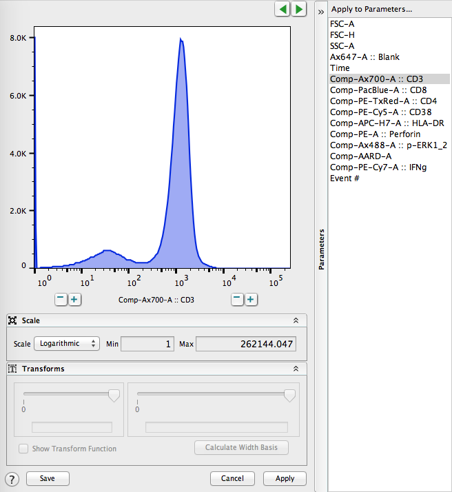
4. Select “Customize Axis” from the list and and an interface will open as shown below:

5. Select the scale you wish to use by clicking the drop-down menu in the section labeled “Scale”. FlowJo v10 offers 7 different scaling options. For details about each scale click here.

6. Use the “+” and “-” buttons or the Min and Max field boxes to adjust the range of the selected scale. Note, for some scale options you will have to use the Transforms section to adjust visualization space towards the left and/or bottom of the Graph Window.

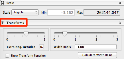
7. (Optional, for non-log and non-linear scales). Adjust the transform by using the sliders in the Transform section of the panel. The leftmost slider controls the number of extra negative decades you can add. The width basis slider controls the size of the linear scale beginning at zero.

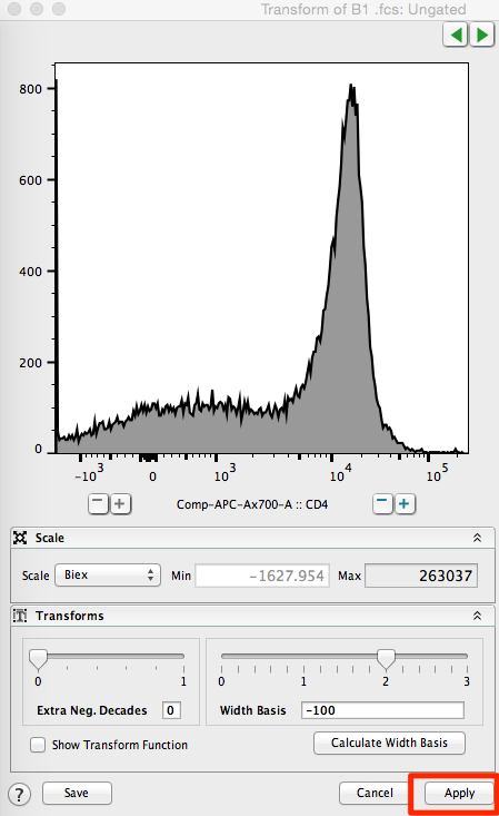
8. Click the “Apply” button on the bottom right of the Transform window to apply the scaling transformation to the workspace. Alternatively, you can click the “Save” button on the bottom left, to save this transformation to your preferences such that all future workspaces will automatically transform the data to your preferred choice.
For more links about the T -Button:
Display Transformation and Digital Data
Why Biexponential Transformation?
Biexponential Transformation Instructions
If you are having trouble transforming your data or need general tech support, please email TechSupport at FlowJo.com.

