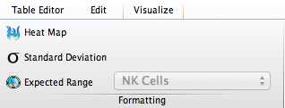
FlowJo’s Table Editor includes options to accent/highlight values via the use of heat map, distribution stats, or expected range. These are assigned using the Columns band of the Table Editor ribbon:

Heat-mapping is a visual technique which assigns a yellow/blue gradient to a range of data, varying the color based on the current cells’ value relative to the distribution of values in the whole column.
Colors can be assigned using distribution stats – for example values exceeding 1 standard dev from the mean can be made one text style, while 2 standard devs – another.
Finally you can mark cells as being “in” or “out” of a predefined range (such as a frequency of CD3+ cells in Lymphocytes, etc. )
To apply heat mapping, or other formatting, to a single column :
- Select a row in the table editor and click on the Formatting band in the Visualize ribbon
- Click the heat map button (notice the heat map icon appears in the Population column)
- If using Expected Range, pick the range you would like to heat map from the drop down box to the right.
To apply formatting to all columns:
- Select multiple rows in the table editor and click on the Formatting band in the Visualize Ribbon
- Click the heat map button (notice the heat map icons appears in all the Population columns)
- If using Expected Range, pick the range you would like to heat map from the drop down box to the right.
For more information on setting ranges, click here.
