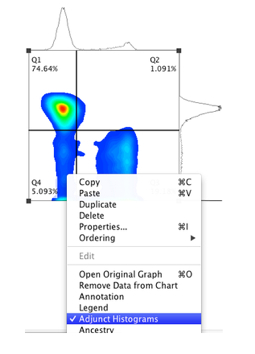
Adjunct Histograms display the univariate plots that correspond to the parameters used to create a bivariate plot. They can be a helpful tool, especially for visualizing edge events that may blend into the axes of a two dimensional plot.
They are an available option in the Layout Editor.
When displayed, the upper univariate plot (histogram) displays that X-axis parameter distribution, and the right histogram shows the Y-axis parameter distribution.
- Drag a population or subpopulation node from the workspace to the layout editor. Change the graph type, if desired, by double clicking on the plot to bring up the Graph Definition window.
- Right-click inside the plot, and choose Adjunct Histograms (it will become checked).
- To hide the adjunct histograms, right-click again on the plot and choose Adjunct Histograms again (it will become unchecked).

Fig 1: Using Adjunct Histogram to show relative size of Q1 vs Q3 populations.
