Edit any plot even after it has been placed into the Layout Editor.
After placing plots into the Layout Editor, double clicking on any plot or overlay will bring up the Graph Definition window. From this window many alterations and customization’s of your plot are available. The window has four tabs: Specify, Annotate, Fonts and Legend.
Hint: graph definitions for multiple charts can be changed simultaneously by selecting multiple charts (via cursor drag, or Ctrl (PC) or Cmd (Mac) clicking ) and then double clicking on one of the selected charts. The number of items being edited will be specified in the title bar of the dialog.
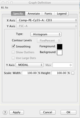
Specify Tab:
options for changing the axis parameters, plot type, background and foreground color and scaling. This is similar to the Options and Active Gate area of the Graph Window.
- Change plot types like contour, dot plot, or density
- Edit the parameters displayed on the x- and y-axis
- Smooth plots
- Change the foreground and background colors
- Change y-axis scaling for histograms
- There are four settings for Y-Axis scaling.
- The default is to have FlowJo determine the optimal limits (Auto), by basing the scaling on the count for events in each channel along the X-axis off off of the channel with the highest number of events.
- The Manual option allows you to specify a maximum count for events and all channels will be scaled as a percentage of that maximum count.
- The Modal option scales all channels as a percentage of the maximum count.
- The Unit Area option sets max area of 1 unit, with each channel showing as a percentage of the max area.

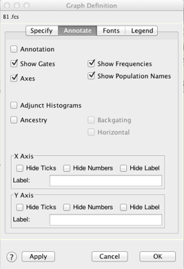
Annotate Tab:
determines what additional annotations accompany the plot. These options will set the visibility of the legend, chart annotation, ancestry, chart axis labels, ticks and number and adjunct histograms. Only the initial (first) layer of an overlay will display gating information, so if you want to show gates, the layer whose gates you want visible, should be the first or base layer of the overlay.
This tab is most often used to customize the names on the axis.

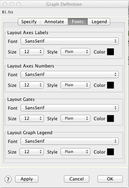
The Fonts Panel:
The Fonts panel sets the text attributes of the axis labels, the numbers along the axes, and the statistics and names of gates on top of the graphs.
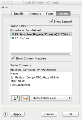
The Legend Panel
Legends can be added to any plot or overlay. In the case of overlays, the list of populations comprising the layers of the chart show in the Table Rows area of the Legend.
One of the most common features used here is to “lock a control” population. Double-clicking a population here will mark it as a control sample (indicated in this window and the resulting legend by italicized text, Sample B1 below). A control sample is locked to its original value. This means that it will not change during a batch iteration operation, instead it will be overlaid on the other samples in the operation. You can set as many control samples/populations as you desire.

From the Table Columns area, attributes can be added into the legend table. Examples include statistics, FCS keywords and population path information. Statistics, keywords, and annotation can also be added here in the drop down boxes. They only pertain to the sample listed in the top.
You can add statistics directly right here or drag then from the workspace.
Statistics will only show for the populations that are listed in the Table Rows box. For example, if you added a Median statistic to the lymphocytes gate, the lymphocytes gate is not listed, so the statistic would not be available. You would need to drag the lymphocyte population to the “Table Rows” section of this interface.
These panels provide the interface to customize all of the aspect of the chart. The Apply button will immediately apply edited characteristics to the selected chart. The Ok button confirms changes.
Tags: FlowJo
