Compare a control to an experimental set, evaluate the accuracy of gates, find high or low expressors, or a perform a myriad of other analyses using Overlays in FlowJo v10.
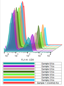
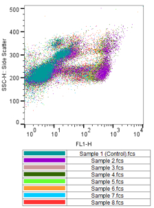
Overlaying univariate or bivariate plots is a powerful visual tool to for cytometric analyses. Differences between populations within a single experiment or amongst groups of experiments are easily seen. Find rare populations, identify various subsets, define cytokine expressing cells, compare controls to experimentals and many other functions with overlays.
FlowJo vX allows you to create both univariate (histograms, cumulative distribution function) and bivariate (dot, pseudocolor, density, contour, and zebra plots) Overlays within the Layout Editor. Histogram overlays have the added benefit of being displayed offset to one another, the controls of which are discussed further below.
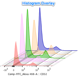
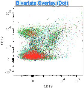
Creating an Overlay in the Layout Editor.
Creating Overlays in FlowJo v10 is fast and easy. To create an overlay, drag a population from the Workspace into the Layout Editor. Then drag a second population on top of the first one. FlowJo will create an Overlay based on the type of plot that was last used in the Graph Window for that population (e.g. a dot plot if you were looking at scatter or fluorescent parameters on both the X- and Y-axes). To add additional populations to the Overlay, simply repeat the process, or select multiple populations from the Workspace and drag-and-drop them on a plot in the Layout Editor at once. Please note, you can drag and drop a histogram onto a dot plot or vise versa. The resulting Overlay type is dependent on the plot being dragged into (i.e if you started with a histogram and dragged in a dot plot, you will get a histogram overlay).
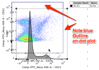
When an overlay is allowed, you’ll see the borders of the chart box of the first population highlighted (in blue) to signify that it will accept the contents of the drag. You can drag populations in from the Workspace, or from the Layout Editor.
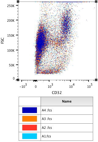
As you add populations to the Overlay, FlowJo keeps track of them in the Legend and assigns a different color to each additional population.
Overlays, as well as any other type of plot in the Layout Editor, can be modified in multiple ways. You can change the order of populations within an overlay, scaling (histograms), axes, axes labels, fonts, colors, add presets, etc. We will discuss the options most pertinent to overlays below. For more information on changing displays within the Layout Editor, go here.
Overlay Options – Population Color.
As you add a population to an overlay in the Layout Editor, FlowJo will assign a color to the population as well as a name in the Legend.

To change the color of the population within an Overlay, first select the Legend, then scroll over the color assignment square on the left. Mouse over the square until the cursor changes from an arrow to a hand. While the cursor is displayed as a hand, click the mouse and a color palette will appear. Select the color you would like the corresponding population to be.
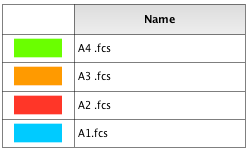
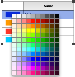
Note: It may be helpful to choose a highly contrasting color (navy blue, black) for rare populations to make them easier to see.
Histograms have a few more options when it comes to changing their color and appearance. In addition to simply changing the population color, you can choose to tint the histogram, use different line styles, and apply different line weights. Control clicking (Mac) or right-clicking (PC) on a histogram Legend spawns the following menu:
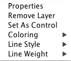
Selecting the Properties option will open the Graph Definition window.
Remove layer is discussed below.
Coloring changes the tinting of the area under the selected population’s graph.
Line Style changes the type of line representing the selected population’s graph (dashed, dotted, solid, etc).
Line Weight changes the thickness of the line representing the selected population’s graph.
To change the size of the overlay or legend click and drag on the black square handles located at their corners.
Overlay Options – Population Order.
You can change the order that your population occurs within an Overlay. To change the order, first select the Legend in the Layout Editor, then select the population name in the Legend by clicking once with the mouse. The population will be highlighted in blue. With the cursor on the highlighted row, click and hold the mouse, dragging the highlighted population to the top of the list (foremost priority) or to the bottom of the list (lowest priority).
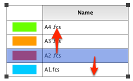
This is most apparent with staggered histogram overlays, but is important for bivariate overlays as well. Consider a bivariate overlay where you are looking for a small subset of cells cast against a much larger pool of cells coming from a parental gate. Setting the population with the fewest number of cells to the top of the list in the Legend (and adding a contrasting color) will help you visualize the population.
Overlay Options – Setting a Control
One of the most powerful uses of Overlays is the ability to set a control population and visualize how it compares to experimental populations.
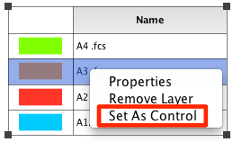
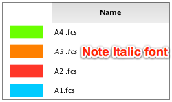
To set a control population in an Overlay, first select the Legend in the Layout Editor. Next select the population you would like to set as a control. The population will be highlighted in blue when selected. Control-click (Mac) or right-click (PC) to get the Legend pop up menu. Select “Set as Control” from the menu. FlowJo will then italicize the font in the Legend and will lock this sample as a control for batch analysis to other samples within the group or the entire workspace.
Overlay Options – Removing an Overlaid Population.
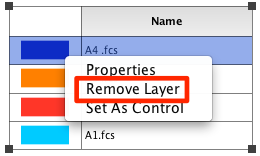
To remove an overlaid population from the display, first select the Legend in the Layout Editor. Highlight the population you wish to remove by moving the cursor to the desired population and clicking once. Control-click (Mac) or right-click (PC) to get the Legend pop up menu. Select “Remove Layer” from the menu.

You can also delete the population from the workspace and it will subsequently be removed from the Overlay. However, use caution with this approach. If you delete a population further up on the gating tree, all subsequent dependent populations will also be deleted.
Offsetting Histogram Overlays
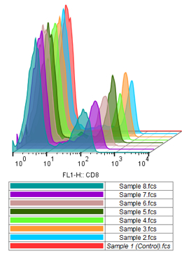
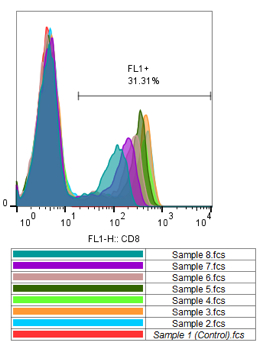
Right-click on any histogram overlay in the Layout Editor and choose Histograms from the menu. You will be presented with the following options: Offset, Half Offset,Stagger Offset and Overlaid.

Offset: places all histogram on a vertical offset that fills the chart, scaled to avoid overlap.
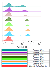
Half Offset: uses half the amount vertical offset, for taller histograms, which may overlap.
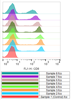
Stagger Offset: this setting creates a psuedo 3-D look and allows you to change the vertical and horizontal offsets. Once stagger is selected, a blue handle (small square) will appear in the right corner. Click and drag to resize the histogram cube to your desired dimensions and offsets levels.
Overlaid: does not offset the histograms vertically. All are drawn on top of each other.
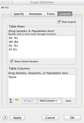
Clicking Legend Properties brings up the Graph Definition window. The Graph Definition window is used to change the number of Table Rows and Table Columns. Statistics, Keywords, or Populations can be added to Table Columns.
If you have any trouble or questions regarding Overlays, please email techsupport@flowjo.com.


