The Multigraph feature is a tool for exploring data in n-dimensions using a variety of graphical options.
To access the Multigraph interface in version 10, place a plot in the layout editor and right click on the plot. At the bottom of the right-click interface, there is an option for Multigraph called “Make Multigraph Overlay”. All options work with single samples, but most work with multiple samples/populations overlaid, creating graphics that emphasize comparison.
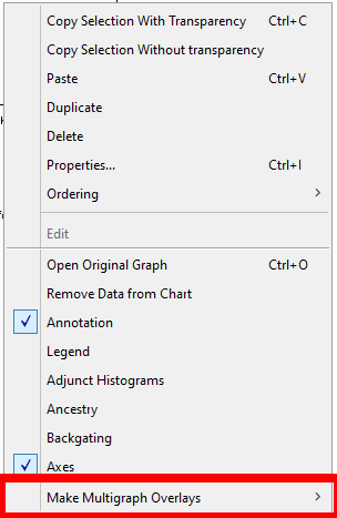
If you expand the Multigraph interface, you’ll notice three options. You’ll see a fourth option, Multigraph Color Mapping, if you have right-clicked on a single population plot, as that option is only possible on single populations:

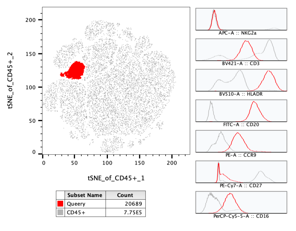
Histograms will provide you a multigraph with a histogram of every parameter in the data file. If you have multiple populations overlaid, each of those populations will be in each histogram with the color preserved from the original plot. Right-clicking on the multi-histogram plot will bring up a dialog for showing or hiding parameters.
In the example below a Query gate is overlaid on the parent population, with multigraph histograms enabled, including seven parameters. Including the parent population in the overlay provides context to interpret the histograms on the Query gate. In this example we can see the highlighted population is expressing more CD20, HLA-DR, and CD16 than most of the other cells.
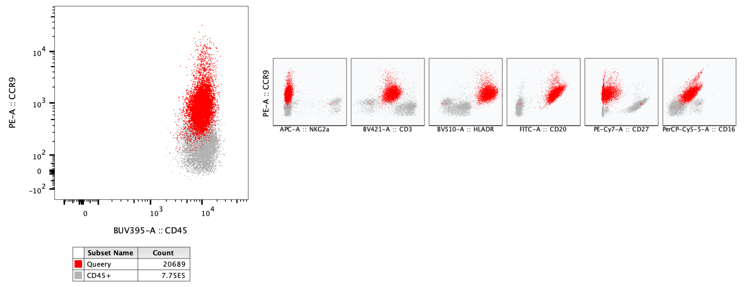
All Parameters by Y will provide 2D plots with every parameter versus the current Y axis of the primary plot.
In the example below a Query gate is again overlaid with the parent population and the all-by-Y plot is used to highlight the expression of CCR9 in conjunction with each of the other markers for both populations.
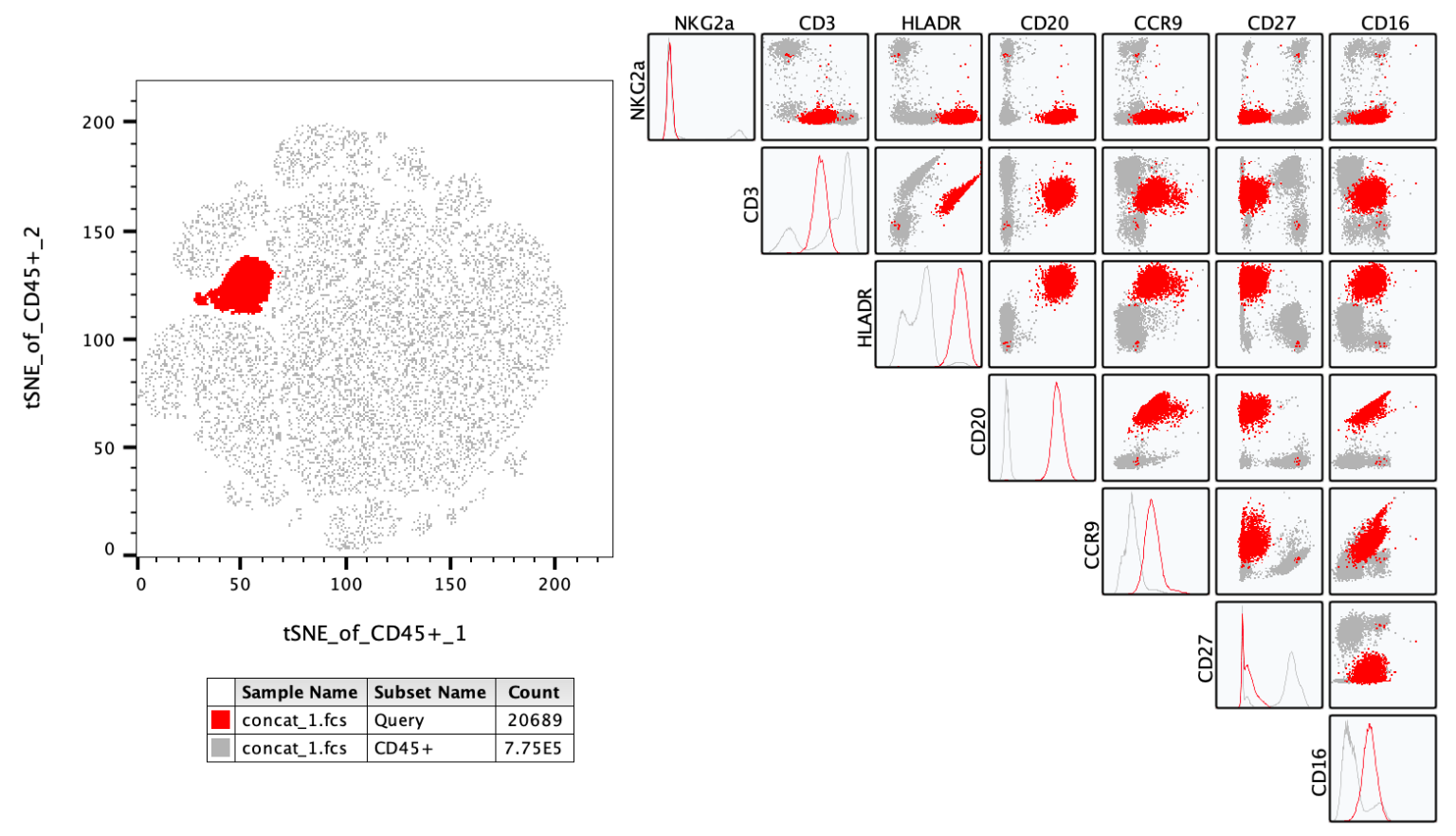
NxN Plots display every combination of parameters in the population.
In the example below a Query gate was once again overlaid with the parent population, but now that population is displayed in a series of 2D plots, allowing a cytometrist to view a complex population identified in this case on a tSNE map in a traditional manner.
Color map plots display the original graph heat mapped for as many parameters as selected. This feature is only available when a single population is represented by the primary plot. When the color map selection is made a dialog will appear asking which parameters should be included. On selection, the plots will be created next to the primary plot.
In the example below the entire parent population used in the preceding examples is shown using a pseudocolor plot to highlight all the collected CD45 events on a tSNE plot using color to indicate density. To understand the phenotype of each of the large islands color mapping has been turned on, with seven additional parameters used as the heatmap color for seven distinct plots. The brighter the color, the more intensely a set of cells express the associated parameter.
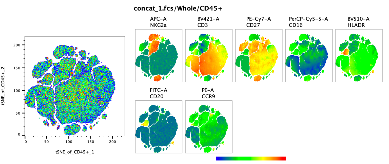
Pro-Tip: FlowJo uses the range of the display space to set the color on the colored heat maps plots. Cells that are plotted near the left edge will be blue, cells at the right edge right, and everything in between will be on the gradient. If there is significant white space on either edge no cells with have the most extreme colors, so to create the most contrast the T-button can be used to trim out the white space.
The example below shows the same tSNE plot with CD3 heat mapped. In the upper pair of graphics a full decade of whitespace is displayed on the CD3 axis. The Duplicate Plot button is of use here to create a second plot of the same population + parameters. The second plot can then be used to show parameters of interest, here CD3, and the T-button can be used to trim out the whitespace, with the result shown in the plot below.
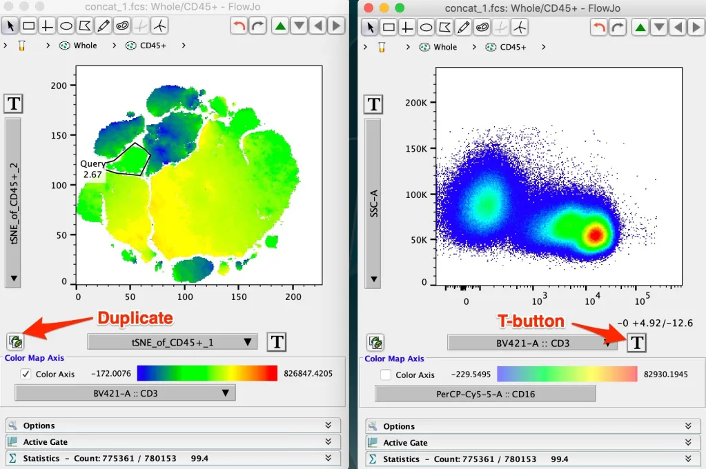
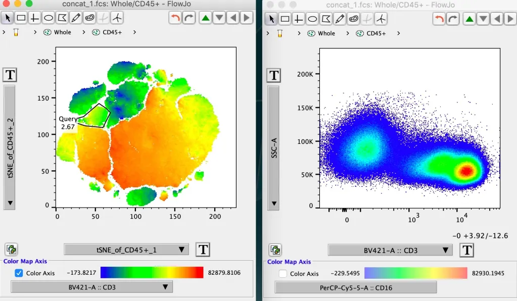
FlowJo uses the display range to represent brightness, as opposed to plotting the brightest cell the brightest color, to avoid misrepresenting data in which all cells are expressing a given marker at only background or dim intensity as being very positive.
For assistance please contact our tech support team.
