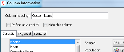
Column Information dialog.

First, it may be useful to give your column a custom name. By default a name displayed for the header of each column will be constructed using the path, ancestry, parameter, etc. – various details about where the number came from. This can sometimes be hard to read – entering your own custom labels may make the output easier to read.
You can also choose to hide a column altogether, this is useful if a column only serves an intermediate step in a formula calculation. When generated, a table will not display “hidden” columns, but the numbers in those can still be referenced by formulas in “showing” columns.
Finally, you can “hold” a value by choosing not to iterate it. This is done by checking the “Define as Control” button.
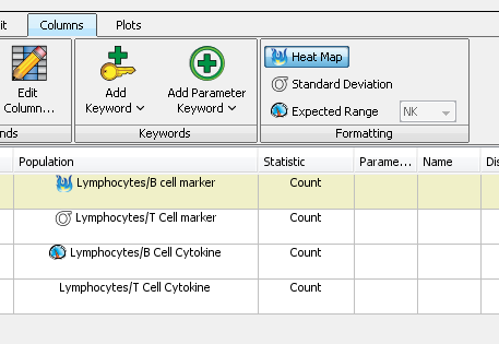
Additionally, each column can be assigned special formatting flags which will change text/background color and/or font style. Notice below the icons in the Population column – which correspond to the options of heatmap, S.D., or a pre-defined range.

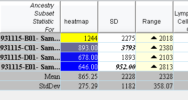
Here is how the output of the above table looks: leftmost column is heat-mapped, SD-formatted column changes text style based on the cell values difference from the mean in this column, and the range styling uses icons to show if our values is in/above/below range:

For more information about the Table Editor:
Heat Maps & Conditional Formatting
Statistics in the Table Editor
