Create a quick time series plot right in FlowJo!
The time series requires the input of one or more columns into the table editor.
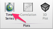
To begin, select one or more of your table’s columns, then hit the Time Series button. The Time Series button can be found in the Plot band by default.

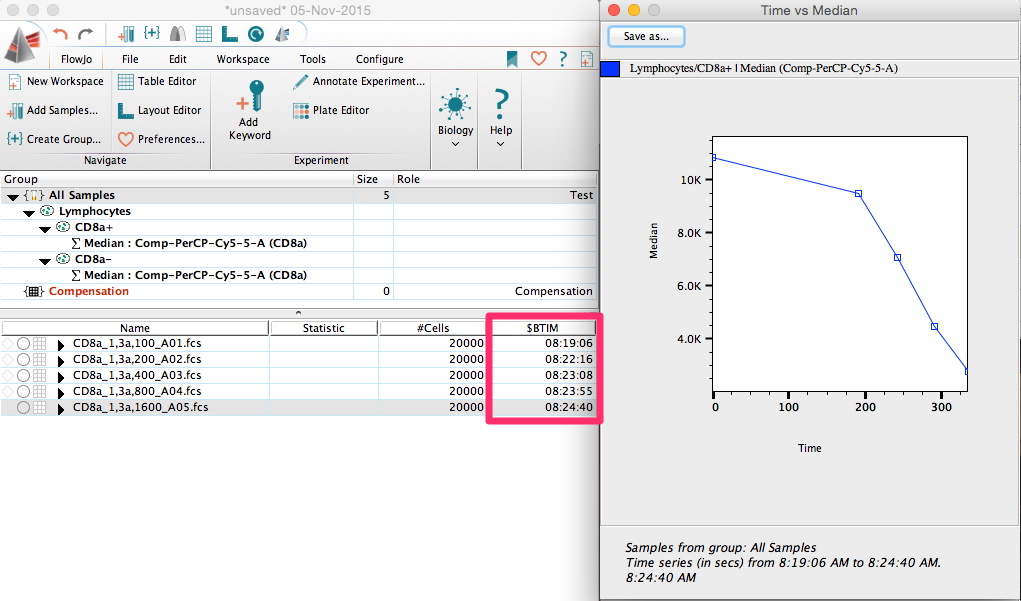
Once launched, it will return a plot of your selected column vs the range of time points as constructed from the data selection in the current group using the $BTIM of the files in your workspace.
For example, using our basic tutorial data, we can plot MFI over time for the five files. This is a titration experiment, so MFI decreased over time due to reduced concentrations of antibody.

Admittedly, this probably isn’t the ideal data set, but you can imagine if you were looking at a time series of data acquired every hour or at multiple time points over a few days, that this time series plot could be very useful for measuring changes in any statistic such as cell frequency, MFI, etc.
