Create spectral plots for selected detectors and populations.
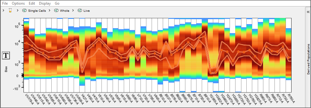
The spectral plot tool is available from the Cytometry band. To activate it, select a sample or population and click the tool. It will prompt the user to select a set of detectors for display, and on selection create a plot of the signal measured in each detector for the selected population. The default view displays the density of events by intensity for each detector, as well as a dotted line indicating the median value and lines demarcating the 25th and 75th percentiles:

Note that every detector is showing the signal intensity for all of the events in the selected population. Scaling for all parameters can be adjusted using the T-button in the Y-axis.
Menu Selections
File
- The file menu includes the choice to export the graphical display
Options
- Show bands: Toggles the median and standard deviation band on/off
- Show violins: Toggles a violin plot to each detector to represent the distribution of cells by intensity
- Show density: Toggles the density coloring on/off
- Configure: Opens a window that allows the user to customize the upper and lower percentile bands as well as the density display. The density display illustrates the concentration of events per intensity and can be scaled to linear, log, or probabilistic
- Parameters: Re-opens the detector selection menu, allowing for modification
Edit
- Undo / Redo
- A variety of copy options
Display
- Show grid: Toggles on/off the grid lines indicating the bounds of each detector
- Show zero line: Toggles on/off a line at 0 intensity as a reference point
- Population Names: Users can draw a gate on any detector(s), or portion of cells in a detector to isolate that population for further use. To use these populations in the spectral viewer, the user can open the derived parameters wing on the right side of the window, and click create new once gate has been drawn and name that population. This menu option allows the user to choose between showing the name of that population in the list, to include the path, or just the samples name
Go
- Show workspace
- Navigate up the parent population / down to the child population
- Navigate to the next / previous sample in the workspace list
Additional functionality
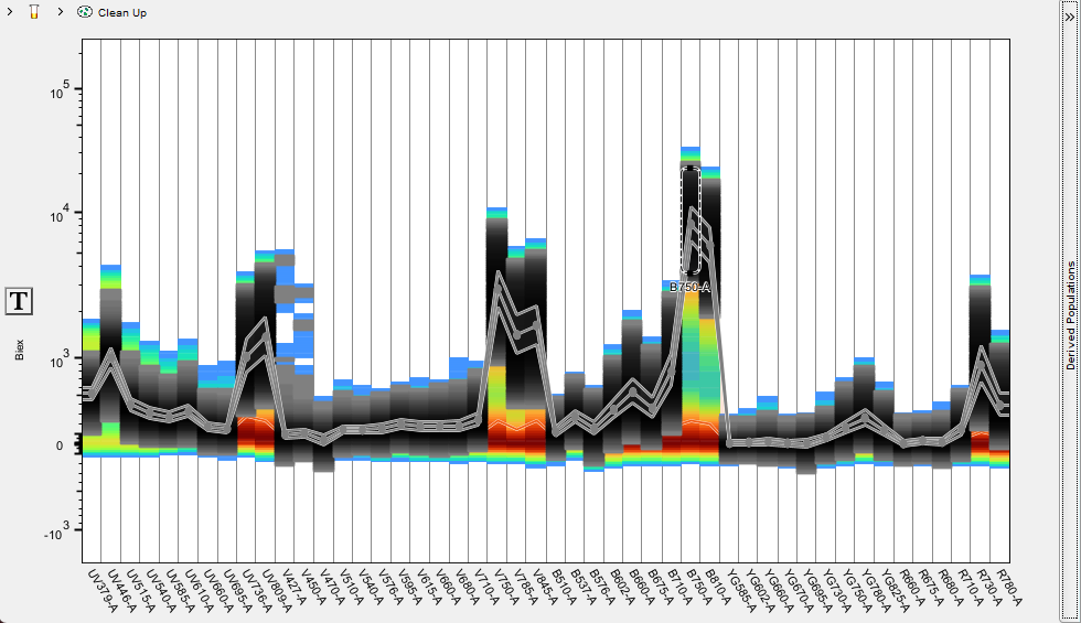
Gate can be drawn on any detector or combination of detectors to isolate cells with specific intensity within this detector. This tool can be useful in identifying positive/negative controls for compensation. In the example below a gate is drawn on the high intensity portion of cells in the B-750 detector using the compensation control for Brilliant Blue 755. Below the screenshot of the spectral plot is a snippet of the compensation window in which that gate was automatically selected by the compensation wizard for use as the positive exemplar.


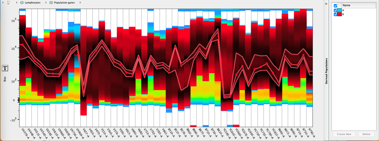
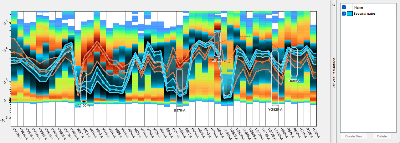
Further, the events within one or multiple gates can be preserved as a derived population by clicking the Create button in the derived population side bar. Spectra of specific derived populations can be visualized by checking the box to enable them, and multiple populations from this sample can be compared if created in this manner.

Each time Create New is selected, a population will be drawn within the workspace and given a name matching the derived parameter. A sub-gate will also be created identifying the detector the gate was created on. If subsequent gates are drawn they will be named after the detector they were drawn on and placed as subset of the derived parameter gate, and a Boolean AND combination of all of the sub-gates will be automatically created in case the user would like to see the result of all of the gates together.

Workspace view of the above spectral gates:

