A tool for comparing multiple populations via spectral plots
The spectral populations viewer differs from the spectral plots tool in that it is intended for comparing multiple populations against each other on a spectral plot so that the user may determine which channels population have differential signals in.
To open the spectral population viewer, click on one or more populations and then select the tools from the Cytometry band, located in the FlowJo Ribbon by default. Samples can be added via drag and drop after opening the tool as well:

The user will be prompted to select which detectors to display and the most common choice will be all of them to display the full spectrum. The choice of raw versus unmixed (indicated in FlowJo with the ‘Comp-‘ label preceding the parameter name) will depend on your goal. To evaluate the ability to resolve two or more populations based on the acquired parameter and cytometer settings, to check the quality of your single stain control, or perhaps to look at the auto-florescence of multiple populations, choose raw parameters. To evaluate how well two populations can be resolved in gating or cluster, choose unmixed.
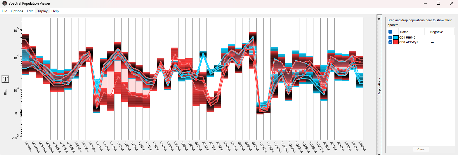
In this example, CD8 and CD4 T-cells have been selected using compensated parameters:

The default view assigns a color to each population and plots a lines that indicate the median intensity for all cells per population for each detector, plot lines indicating the 25th and 75th percentile, as well as shading indicating the density of the signal. Density in these plots will indicate the concentration of events per intensity. It can be configured in the Options menu, and here it is set to 90%, thus hiding the the least dense events and producing a clearer signal.
NOTE: to render this plot, all parameters must have the same transform. If this is not the case, an error message will be displayed until the user clicks the T-button on the Y-axis and unifies the transform and scale.
By selecting two populations that generally lack correlation, we can see that we have a much stronger single in detector B-537 for the blue CD4+ population with CD4 attached to RB545, and a much stronger signal in detector R780 for the CD8+ population, with CD8 attached to APC-H7.
Users can add populations to the view by dragging and dropping them in and change the color by clicking on the color box in the populations legend on the right.
Display Options
The Options menu gives the user a variety of ways to compare populations:
- Similarity matrix – opens a new window showing cosine similarity of the selected populations. A value of 1.0 indicated identical spectral plots for two populations.
- Normalization – The default is ‘none’ which shows the data as is. Normalized to positive uses the maximum signal value + a shift in the data to set the range of all parameters to a relative 0-100% scale. Positive/negative uses only the largest value to set all other values to a scale with a maximum value of 100%. If a negative population has been associated with a specific population, normalization will be with respect to the negative, substituting in the intensity of the negative population for the minimum value per detector.
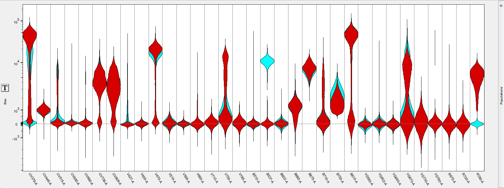
- Bands / Density / Violin – each of these display options can be toggled on/off to customize the data display. Violins only is shown below for the same data as above.
- Configure – allows the user to set the percentiles for the bands as well as the scale and saturation level for density plots.
- Detector selection – re-opens the detector selection window so that the user might turn on/off some detectors to focus on a particular region of the spectrum.

The Display menu allow for toggling on or off the zero line and the vertical grid lines. It also allows the population name to be customized to name the populations by sample, population name, or both.
Exporting graphics
The File menu contains the option to export spectral plots as an image file. The Edit menu contains options to copy the image in a variety of ways to later paste where needed.
