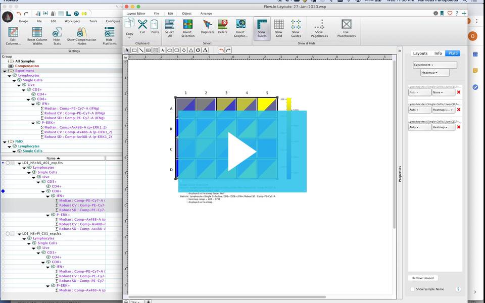
The tool to assist in rapid visualization of plate-based flow data statistics is located in the Layout Editor.
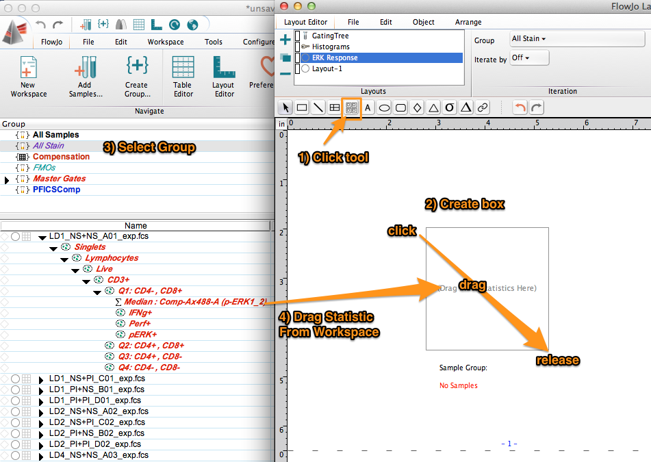
Open the Layout Editor and select the Plate tool. A click, drag and release movement with this tool in the layout editor will create a single open cell.
Within the workspace, select the group you wish to visualize, then select a statistic from the gating tree of a sample. Drag and drop that statistic onto the open cell of the Plate tool in the Layout Editor.
The plate will rescale and display the heat map of the statistic.
In this example, a heatmap for the MFI (median fluorescence intensity) of phosphorylated ERK1/2 on CD8+ cells is generated.
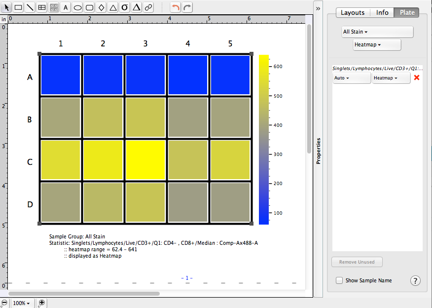
At right you’ll note that the statistic in the heatmap for this plate has been updated as well as annotation at the bottom left of the plate. In addition, there is an option to display the sample name at right.
Additional Options:
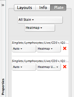
If you drag two statistics at the same time onto the Plate tool cell, you can generate a split heatmap of both statistics.
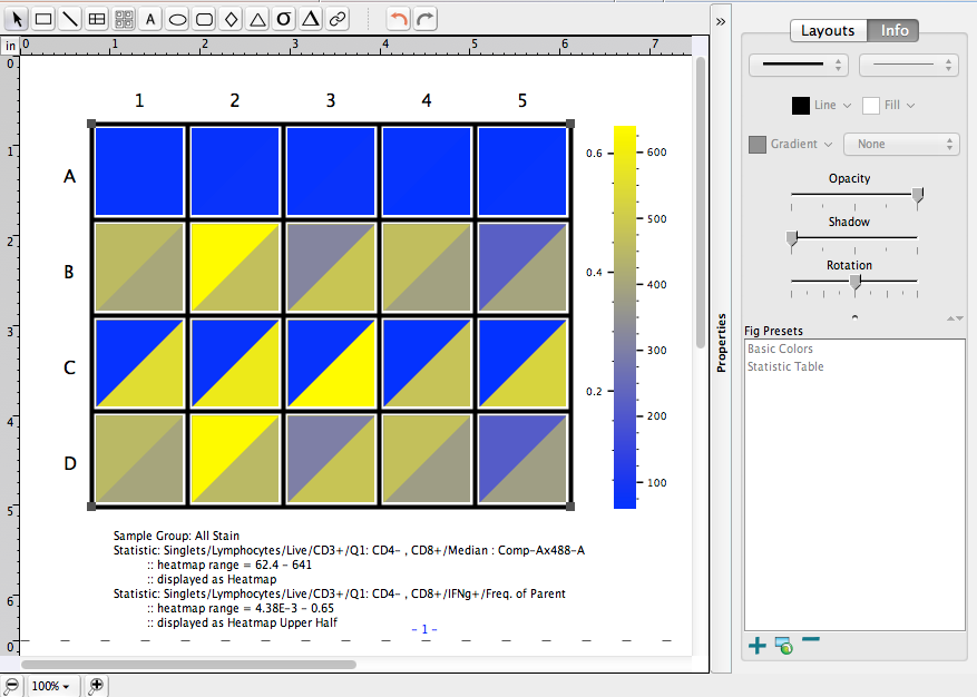
The Properties pop-out options on the right will allow you to control which statistic is listed in which halve:
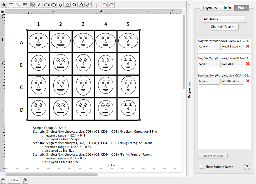
Finally, up to 10 statistics can be viewed using Chernoff faces:
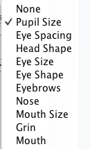
The list of attributes that can be assigned is presented here:
We are also working on methods of plate annotation to facilitate automated analysis, and encourage you to contact us or visit our information page for high throughput analyses to get the latest update to this platform.
See Also:
- Plate Annotation overview
- Importing a spreadsheet of keywords
- Setting up a dilution factor keyword set
- Plates Band
- Plate Editor overview
Tags: FlowJo

