Introduction
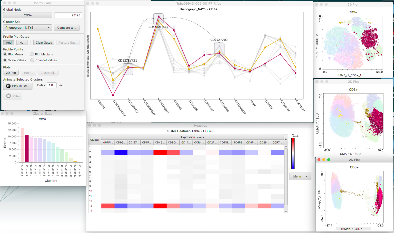
Cluster Explorer is a FlowJo plugin. The tool creates an interactive cluster Profile graph, heatmap, and displays the cluster populations on a tSNE/UMAP plot. The plots are dynamic, can be copied to the clipboard or FlowJo Layout, and allow the user to select populations in one view and highlight the selected population in the other plots. Please view our video for cluster explorer on our website.
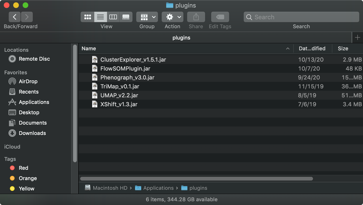
There are detailed instructions on how to set up plugins in our online documentation. Cluster Explorer can be set up by placing the Cluster Explorer JAR file into a “plugins” folder.
Using Cluster Explorer
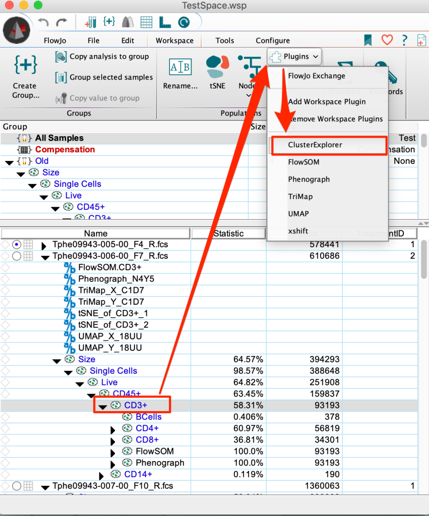
The Cluster Explorer plugin is used after performing clustering and dimensionality reduction with our other FlowJo plugins or tools. Typically, manual gating is first performed on the sample and then clustering is performed on a manually gated population of interest. This clustering is usually followed by dimensionality reduction to help visualize the populations within the sample of interest. Cluster Explorer can then be run on this sample in order to visualize the populations generated by the clustering. Select a population that has had clustering performed on it. Then select Cluster Explorer from the plugins dropdown list.
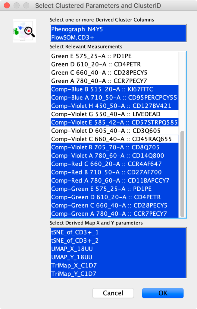
After selecting Cluster Explorer from the plugin list, a window will appear asking the user to select additional inputs. The window is divided into three sections. At the top the user should select the clustering parameters they want to view and compare. Multiple clustering parameters can be selected but only one can be visualized at a time. The middle section allows the user to pick parameters to visualize. Usually it is most appropriate to choose the compensated parameters. The bottom section allows the user to choose any dimensionality reduction x and y parameters to display the clusters on. Multiple sets of dimensionality reduction parameters can be selected.
Once the parameters are selected, Cluster Explorer will generate a heatmap, profile graph, barchart and the overlaid dimensionality reduction plots for the cluster populations.
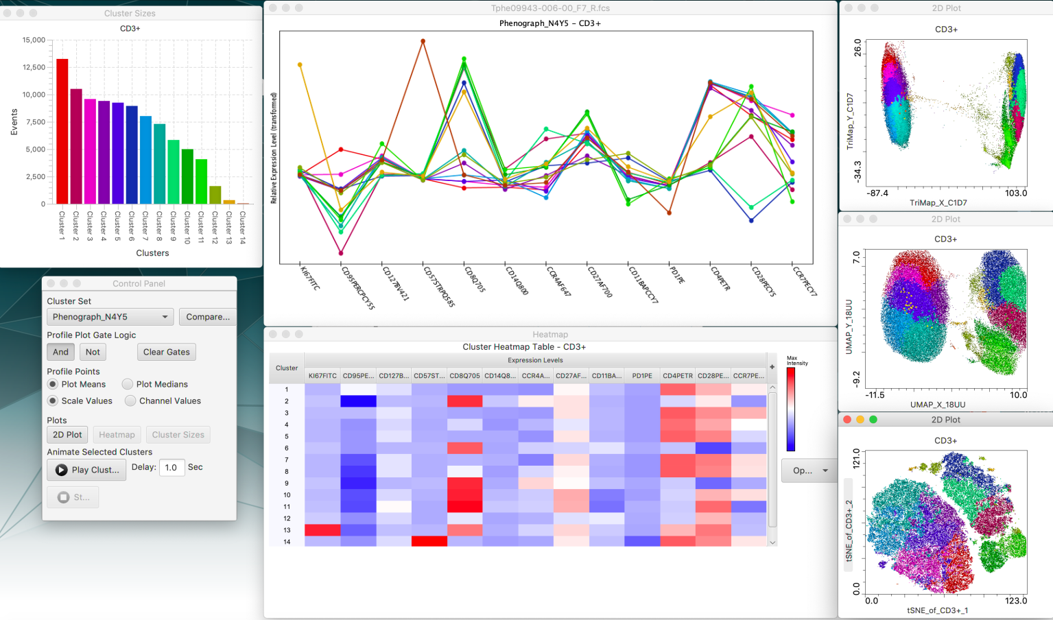
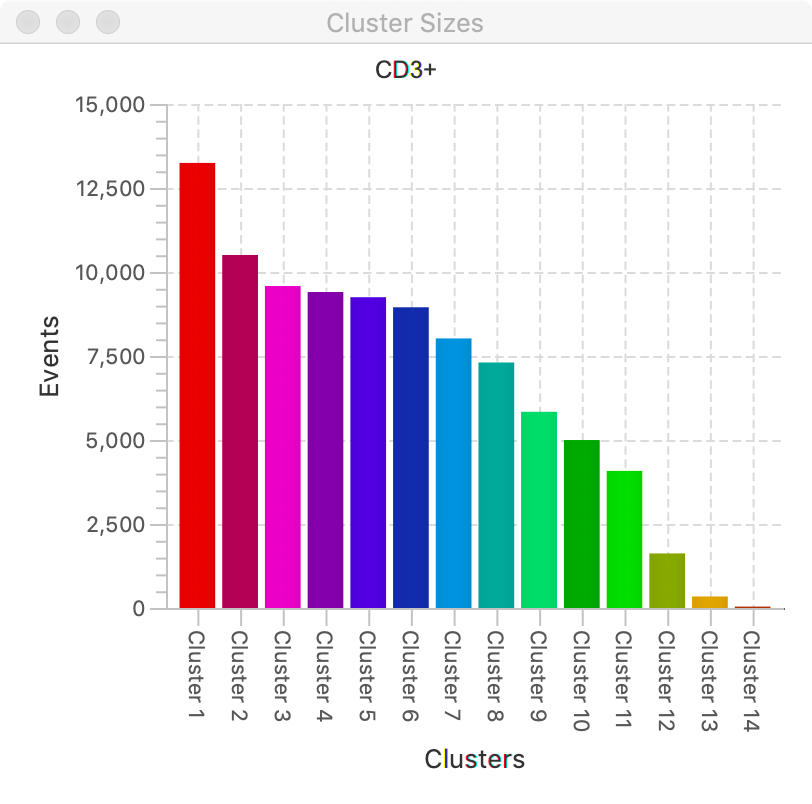
The barchart simply shows the number of events in each cluster.
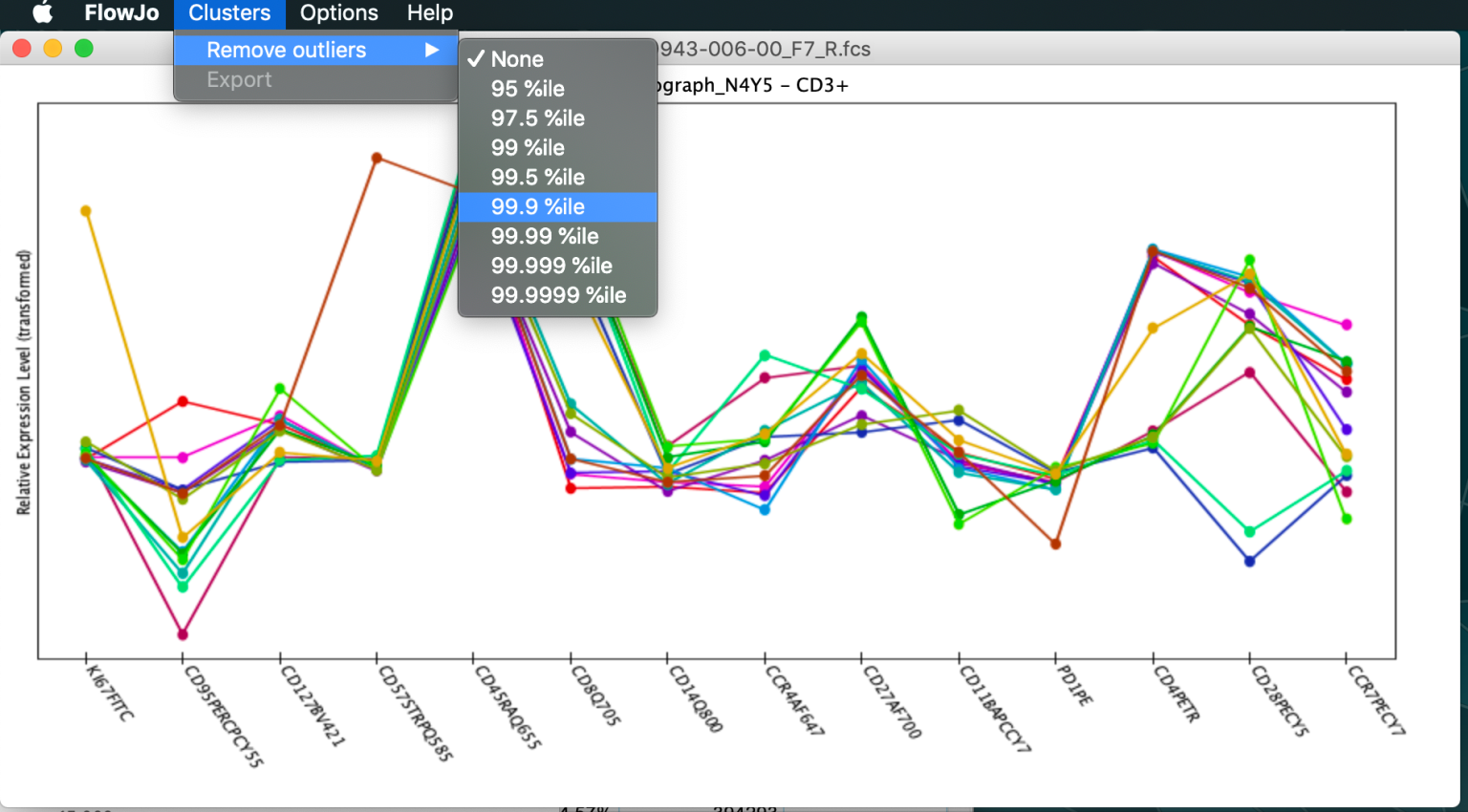
The profile chart shows the relative intensity of each cluster for each parameter. Each colored line represents a cluster and each point shows the relative intensity for that cluster for a given parameter listed on the x axis. Clicking and dragging on the profile plot will create gates around clusters selecting clusters for display. Multiple gates can be created using boolean logic to highlight multiple clusters.

When the profile plot is selected, there is an option under the “Clusters” tab at the top of the screen to remove outliers. These will remove cells from the plots whose signal fall outside of certain percentile thresholds. Under the “Help” tab there is an about which gives additional information.
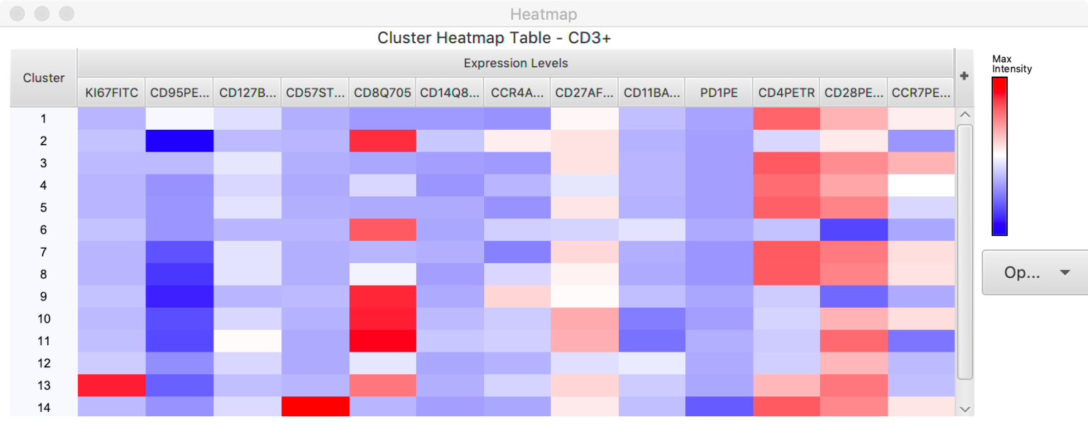
The heatmap shows the relative intensity of each parameter for a given cluster. Additional populations can be added to the heatmap by selecting the “Add nodes as columns option”. This allows the visualization of multiple clustering runs. There are also options for saving the image of the heatmap.
 If dimensionality reduction parameters are chosen, plots will also be displayed of the clusters overlaid on those parameters. Clicking on the axis of these plots will give options for changing the axis. The resolution of these plots can be changed by going to the “Options” tab at the top of the computer and choosing “Adjust Map Resolution”.

All the plots are interactive and if a population is selected in one plot, that same population will be highlighted in the other plots. Double clicking on the Profile plot will reset which clusters are selected.
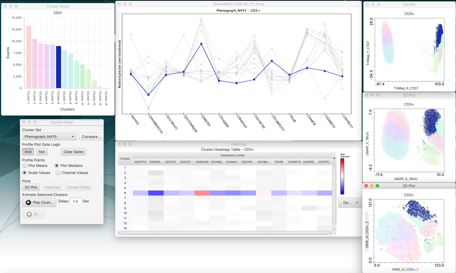
The control panel provides options for the various pieces of cluster explorer.
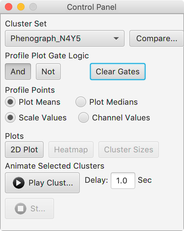
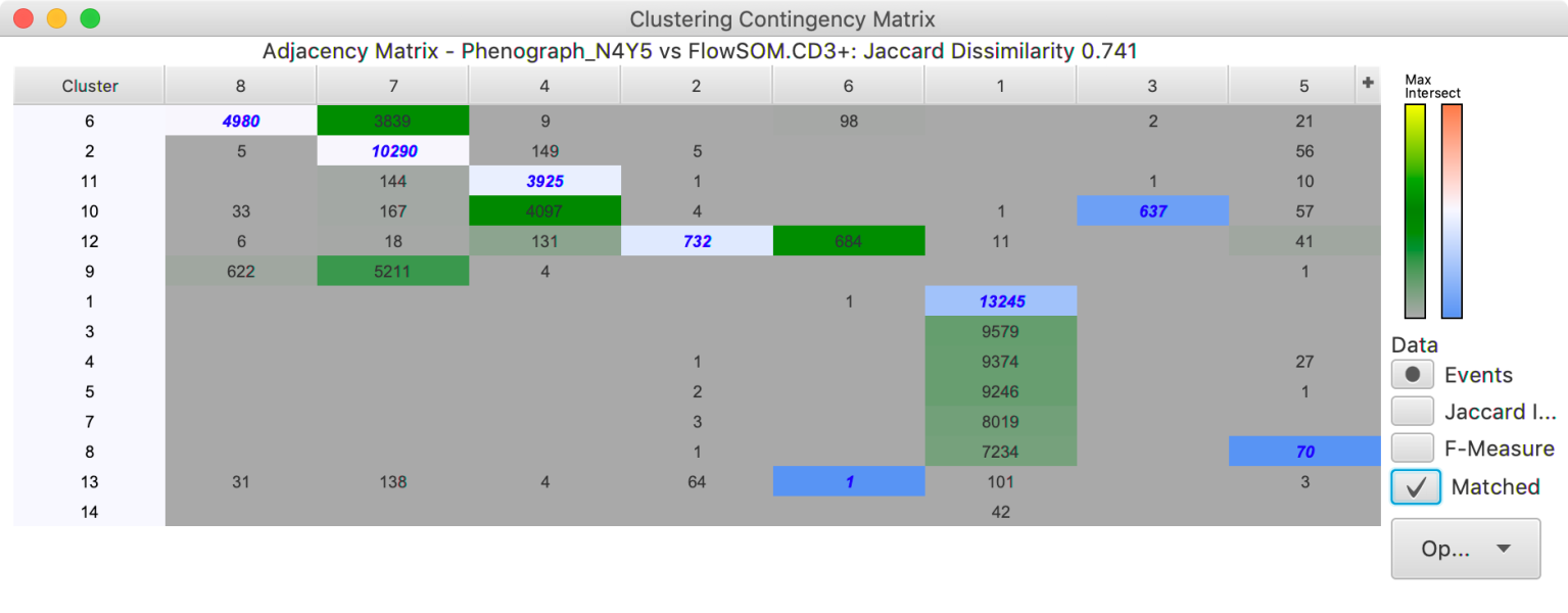
The “Cluster set” allows users to choose which clusters they want to display and allows users to switch between types of clustering. The compare button will open a new window that allows for the comparison between different cluster sets. The comparison will also try to match clusters that seem to contain similar populations between the two cluster sets.
The “Profile Plot Gates” options has options for the boolean logic used to select points with the profile gates. Choosing “and” will cause only the populations that are within all of the profile plot gates to become highlighted. Choosing “Not” will highlight all the populations not present on the profile plot gates. Selecting “Clear Gates” will remove any gates drawn on the profile plot.
The “Profile Points” section of the control panel have options for the statistics being reported in the plots. If a plot window is closed, it can be reopened by selecting it from the “Plots” section of the control panel.
The “Animate Selected Clusters” button can be used to make the plots go through a sequence highlighting
all the individual clusters 1 by 1.
Compatibility
Cluster Explorer is compatible with the following FlowJo plugins and tools
Clustering
Phenograph
FlowSOM
Xshift
Dimensionality Reduction
tSNE
UMAP
TriMap
Leave us your feedback
Please write to flowjo@bd.com with any questions!
